Where to start
After you installed package, you will find Block Builder in Dashboard/Blocks & Settings/Block Builder.

Tab: Block settings
In this tab, you can set basic settings/information about your block.
- Required fields
- Block name (human-readable name of your block e.g. "Example block")
- Block handle (lowercase letters and underscores only e.g. "example_block")
- Block width
- Block height
- Optional fields
- Block description
- Install block after creation
- Block type set
- Entries as first tab
- Max. number of entries (0 for unlimited)
- Use horizontal line as field's divider (this option will add
<hr>tags between field types in form.php - file used, when you add/edit block)- Only if the field type consists of more than 1 element (default):
<hr>will be added after every field type (e.g. if "External Link" consists of fields: url, text, title - then horizontal line will be added after all of them) - Always:
<hr>will be added after every field - Never:
<hr>will not be added
- Only if the field type consists of more than 1 element (default):
- Use horizontal line as field's divider in repeatable entries (same as above)

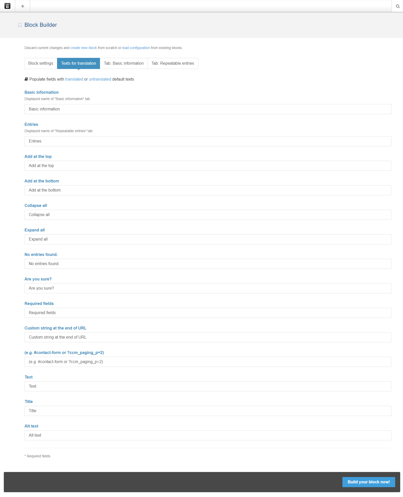
Tab: Texts for translation
All texts will be wrapped in t() function, so they can be translated if you are in need of that functionality.
You can populate fields with english translated strings (only if this package is translated to your language, polish translation is built-in).
Basic information and Entries will be used as tab’s names in your generated block.

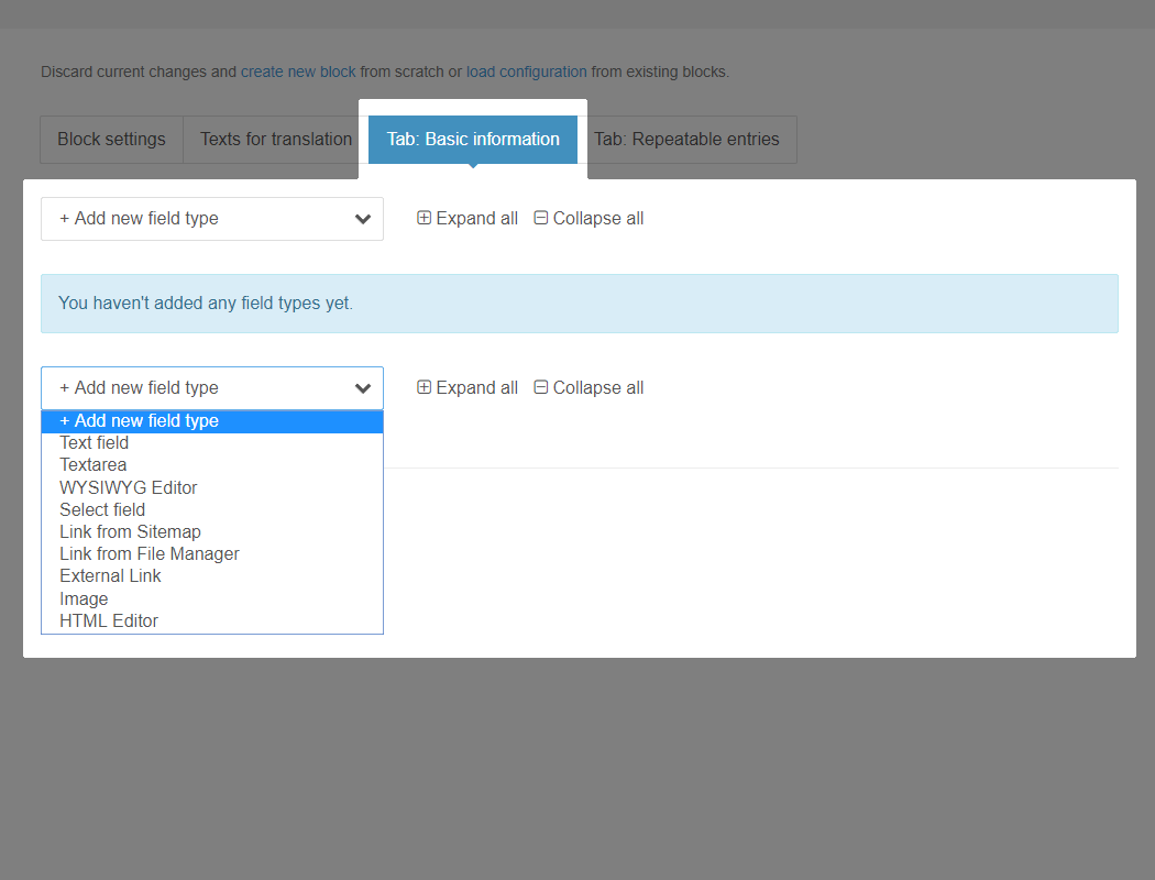
Tab: Basic information
This tab will be used to generate basic non-repeatable fields in your block.
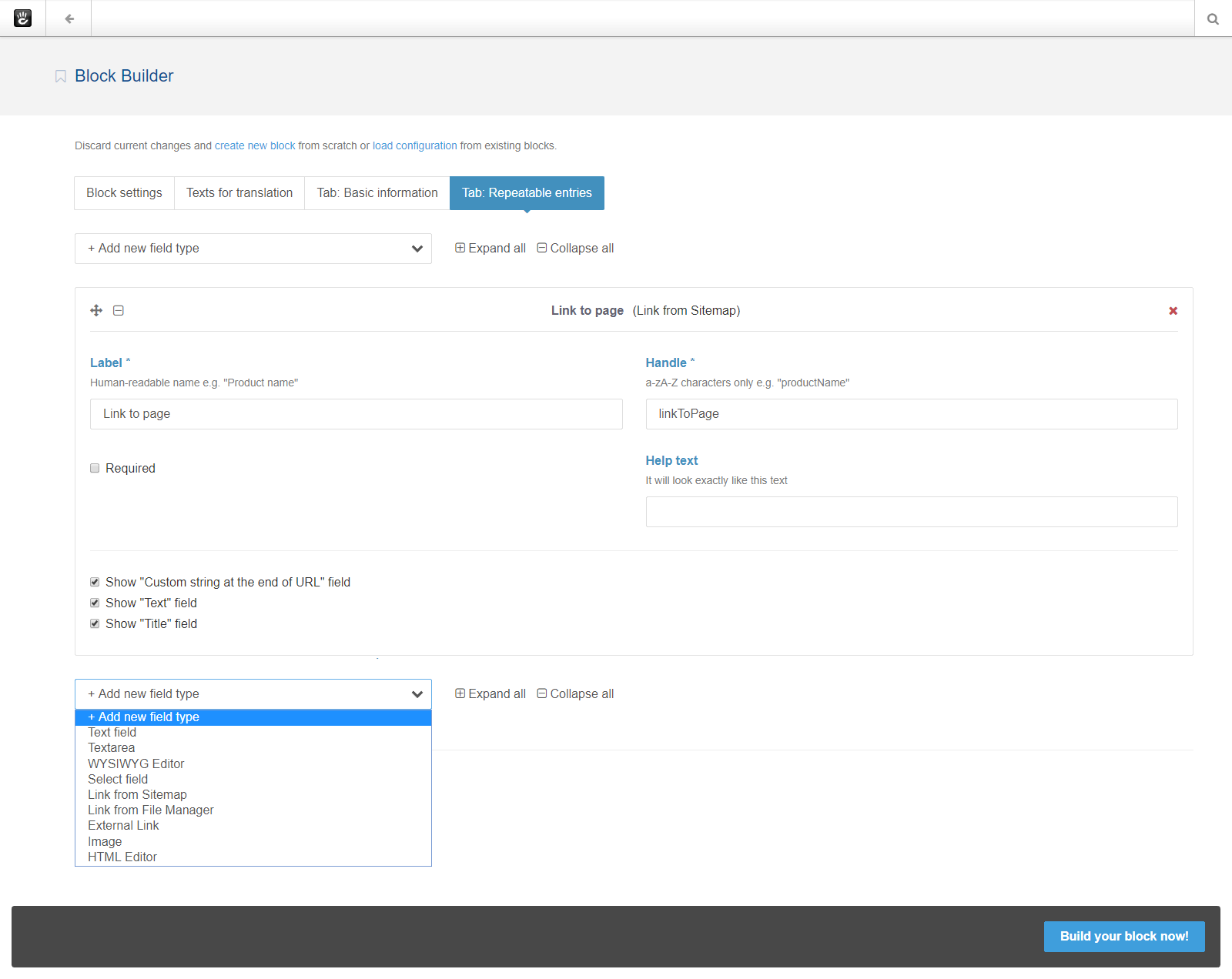
Available field types
- Text
- Textarea
- Height in px
- WYSIWYG Editor
- Height (of editable area) in px
- Single Choice Field
- Select options
Enter every option in new line, e.g.
Don't show
Show
You can also use double colon to specify key (value saved in database, onlya-zA-Z0-9_characters are permitted) and value (displayed text), e.g.
no :: Don't show
yes :: Show
- Select options
- Multiple Choice Field
- See "Single Choice Field"
- Link with Type Selection
- "Link from Sitemap", "Link from File Manager" and "External Link" combined into one field
- Link from Sitemap
- Show "Custom string at the end of URL" field (e.g.
#contact-formor?ccm_paging_p=2) - Show "Text" field (text between link tags
<a>example</a>) - Show "Title" field (
titleattribute, e.g.<a title="example"></a>)
- Show "Custom string at the end of URL" field (e.g.
- Link from File Manager
- Show "Custom string at the end of URL" field (e.g.
#contact-formor?ccm_paging_p=2) - Show "Text" field (text between link tags
<a>example</a>) - Show "Title" field (
titleattribute, e.g.<a title="example"></a>)
- Show "Custom string at the end of URL" field (e.g.
- External Link
- Show "Custom string at the end of URL" field (e.g.
#contact-formor?ccm_paging_p=2) - Show "Text" field (text between link tags
<a>example</a>) - Show "Title" field (
titleattribute, e.g.<a title="example"></a>)
- Show "Custom string at the end of URL" field (e.g.
- Image
- Show "Alt text" field (
altattribute, e.g.<img alt="example" />) - Generate thumbnail using image helper (if original image is bigger than specified dimensions)
- Provide width or height, if you check Crop option you need to provide both
- Generate fullscreen image using image helper (if original image is bigger than specified dimensions)
- Provide width or height, if you check Crop option you need to provide both
- Show "Alt text" field (
- Express
- HTML Editor
- Height in px
- Date Picker
- PHP Date Pattern
Common options
- Label (human-readable name e.g. "Product name")
- Handle (
a-zA-Z_characters only e.g. "productName" or "product_name") - Help text (it will be displayed under label)
- Required (check it, if you want field to be required)
Tab: Repeatable entries
In generated block, you will be able to add multiple entries, which consist of field types added in this tab.
You can have only one set of repeatable entries.
You can use the same field types as in Tab: Basic information.
Additionally, one of the added Text fields can be used as title in repeatable entries (in you block).

Building your block
You can load block config generated previously by Block Builder, by clicking load configuration link (those blocks need to be located in application/blocks folder.
Click Build your block now!, when you fill all required fields.
- if block is already installed - you will need to uninstall it first (click link).
- if block type folder already exists in application/blocks - you will be able to permanently delete it by clicking link.
Generated block can be comprised of up to 2 tabs (basic fields + one set of repeatable entries).
First block tab will contain added field types from dashboard’s Tab: Basic information.
Second block tab will let you add repeatable entries set earlier in dashboard’s Tab: Repeatable entries
If you don't install block immediately after creation, you can manually install/uninstall it in Dashboard/Blocks & Settings/Block Types.
(e.g. http:// yoursite.com/dashboard/blocks/types).

Dashboard screenshots